A Monument Sign refresh can make a huge difference in the way your business looks from the street. People draw conclusions about working with you every time they drive by, based on your building, landscaping and signage. Updating and replacing the fascia signs and monument signs can give your business the new thriving look you need to draw in new clients.
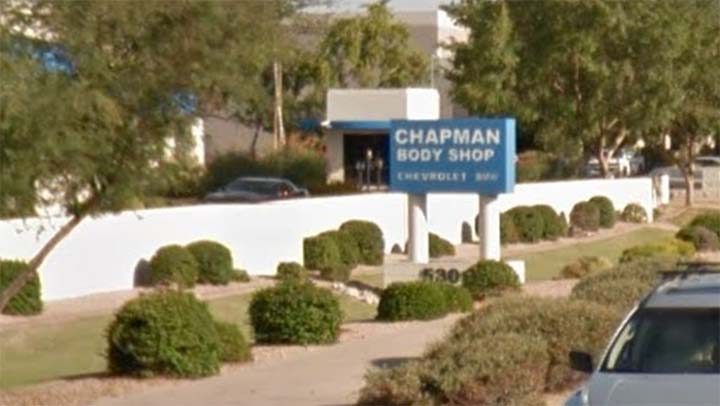
Blue Chip Signworks just completed a nice project for The Chapman Collision Center in Tempe. After creating a new logo for use across their businesses, Chapman is updating many of the properties to be consistent with the new logo and theme. Here is a “before” photo of the monument sign.
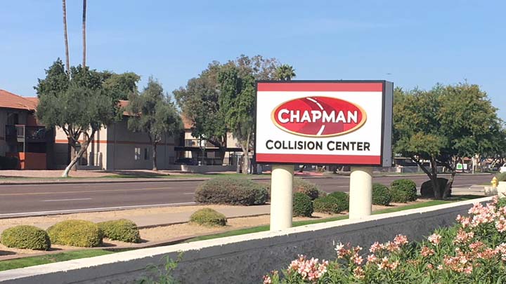
Working with the Chapman team, Blue Chip Signworks designed and fabricated a visually appealing three dimensional sign face for the monument sign. After permitting, we prepared the sign structure with several coats of fresh paint. The existing faces were removed and discarded. The structure was cleaned up and made ready for a refresh. The new sign faces use white aluminum sign panels with formed letters and a black painted metal frame.
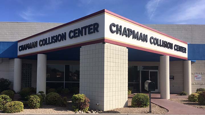
At the same time, we installed new fascia signs, consistent with the monument sign, to complete the updated look. Again, the fascia itself was freshly painted white. Using the same style and font, three dimensional letters were mounted on the fascia. The result is a clean, fresh look consistent with the new branding theme. The color scheme really pops and draws attention to the clean new-looking site.
If you are considering updating the look of your business, remember the signage is a big part of that. New professional signage can really help to set the tone and image of a site. When you are ready to think about a refresh to your signage, we’d love to partner with you to make it happen.


Recent Comments