What makes an effective van graphics? Like many things in this world, the best approach is often to keep it simple. A large, vivid, colorful and easy to understand image showing what your business does with a phone number, a website and a short, to-the-point tagline will outperform lots of text 99% of the time. The goal is to grab attention by presenting a large, interesting and descriptive image to your fellow motorists. Give them a tagline that provides a little more detail about your product specifics or outlines what makes you different. Provide contact information and you are ready to pull in new leads every time you hit the road.
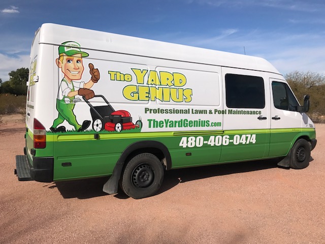
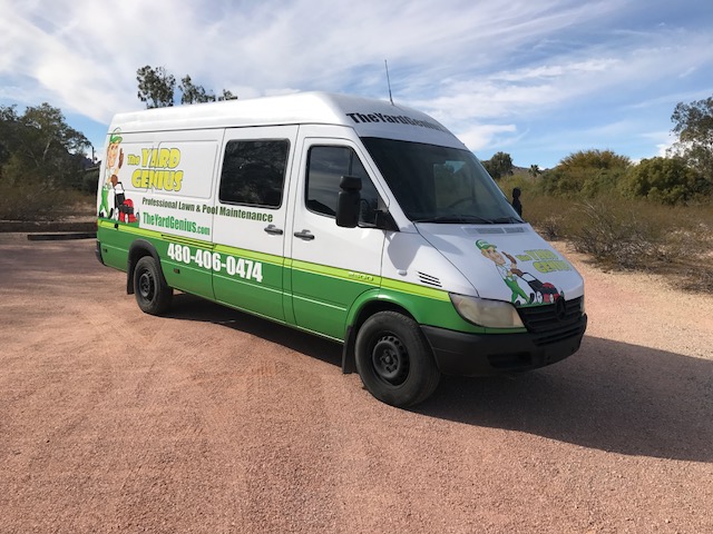
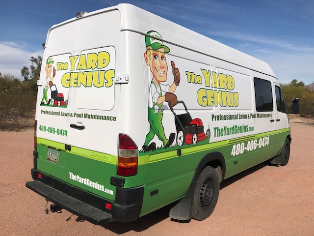
Here is a cargo van we completed last week for our client The Yard Genius of Scottsdale, AZ. The image of a man mowing the lawn is large and grabs your attention. This image immediately lets you know what kind of business this van belongs to. If you are looking for home yard maintenance, you immediately relate to this image. The name of the business is shown in a large font matching well with the image.
The tagline is in bold type and a sans-serif font in keeping with the message. This is a professional lawn and pool maintenance business. The phone number in large white numerals on the green background is very easy to read and jumps off the graphic for you. The same contrast theme is used for the website with the green text on the white background. The rear of the vehicle has the same elements, but for interest, they are swapped with the website in white on green and the phone number in green on white.
Many times in vehicle graphics more is not better. A simple, vivid, easy to understand design will deliver the message with very little required reading.
If you have a company vehicle or several vehicles you’d like to have generate thousands of impressions every day, give us a call at Blue Chip Signworks at 480-785-3940.


Recent Comments